CSS Tutorial: A Comprehensive Guide
Cascading Style Sheets (CSS) is a cornerstone technology of the web, alongside HTML and JavaScript. It allows you to control the appearance and layout of web pages, making them visually appealing and user-friendly. In this tutorial, we’ll cover the basics of CSS, its syntax, and its practical applications, while including relevant resources to enhance your learning experience.
Table of Contents
- What is CSS?
- How CSS Works
- CSS Syntax
- Types of CSS
- Selectors in CSS
- Common CSS Properties
- Advanced CSS Concepts
- Tools and Resources for Learning CSS
- Frequently Asked Questions (FAQs)
- Conclusion
1. What is CSS?
CSS stands for Cascading Style Sheets. It is used to describe how HTML elements should appear on a screen, paper, or other media. CSS saves a lot of work by enabling developers to control the layout of multiple web pages simultaneously.
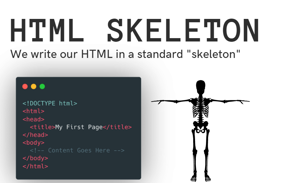
For a detailed understanding of HTML—the backbone of web structure—check out this HTML tutorial.
2. How CSS Works
CSS works by linking a style sheet to an HTML document. The browser reads this style sheet and applies the rules defined in it to render the content in the desired way. This process involves:
- HTML for structure.
- CSS for styling.
- JavaScript for interactivity.
3. CSS Syntax
The basic structure of a CSS rule is as follows:
selector {
  property: value;
}- Selector: Specifies which HTML elements the rule applies to.
- Property: Defines the style aspect (e.g., color, font-size).
- Value: Specifies the setting for the property.
Example:
h1 {
  color: blue;
  font-size: 24px;
}
This rule sets all <h1> elements to have blue text and a font size of 24 pixels.
4. Types of CSS
CSS can be applied in three ways:
- Inline CSS
- Defined within an HTML element.
- Example:
<p style="color: red;">This is inline CSS.</p> - Internal CSS
- Written inside a
<style>tag within the<head>of the HTML document. - Example:
<style> body { background-color: lightblue; } </style> - Written inside a
- External CSS
- Stored in an external file with a
.cssextension and linked using the<link>tag. - Example:
<link rel="stylesheet" href="styles.css"> - Stored in an external file with a
5. Selectors in CSS
Selectors are used to target HTML elements. Common types include:
- Universal Selector (
*) – Targets all elements. - Type Selector (
h1, p) – Targets specific tags. - Class Selector (
.classname) – Targets elements with a specific class. - ID Selector (
#idname) – Targets a specific element with an ID. - Group Selector (
h1, h2, p) – Targets multiple elements.
Example:
.button {
  background-color: green;
  color: white;
}
6. Common CSS Properties
Here are some commonly used CSS properties:
- Text Properties:
color,font-size,font-family,text-align
- Box Model Properties:
margin,padding,border,width,height
- Background Properties:
background-color,background-image,background-size
Example:
.container {
  width: 80%;
  margin: 0 auto;
  padding: 20px;
  border: 1px solid #ccc;
}
7.
Advanced CSS Concepts: Flexbox, CSS Grid, and Media Queries
As web design evolves, developers seek efficient ways to create layouts and ensure responsiveness. Three advanced CSS concepts—Flexbox, CSS Grid, and Media Queries—have become foundational tools for modern web development. Below, we delve into each concept, explaining their purpose, functionality, and practical use cases.
1. Flexbox: Flexible Box Layout
The Flexible Box Layout, commonly known as Flexbox, is a CSS layout model designed to provide efficient ways to align and distribute items within a container. It excels in creating layouts that adjust dynamically based on the size of the content or container.
Key Features:
- Align items both horizontally and vertically.
- Handle dynamic spacing, making items responsive to screen size changes.
- Simplify tasks like centering elements or creating space between items.
Basic Properties:
display: flex;— Enables Flexbox for a container.justify-content— Controls horizontal alignment (e.g.,flex-start,center,space-between).align-items— Controls vertical alignment (e.g.,stretch,center,flex-end).
Example: Centering Items with Flexbox
In this example, items inside .flex-container are horizontally and vertically centered. Flexbox is particularly useful for creating navigation bars, buttons, and card layouts where alignment consistency is crucial.
Use Cases:
- Centering content with ease.
- Creating evenly spaced items, like navigation links or icons.
- Building dynamic layouts that adapt to different screen sizes.
2. CSS Grid: Grid-Based Layout
CSS Grid is a powerful layout system tailored for designing complex, two-dimensional web layouts. Unlike Flexbox, which is ideal for one-dimensional layouts (row or column), CSS Grid allows developers to work with rows and columns simultaneously.
Key Features:
- Define rows and columns with precision.
- Control spacing and alignment across grid areas.
- Create overlapping or nested grid items for intricate designs.
Basic Properties:
display: grid;— Activates the Grid layout.grid-template-columns— Specifies the structure of columns (e.g.,1fr 1frdivides space into two equal parts).gap— Sets spacing between grid items.
Example: Two-Column Grid Layout
This example creates a two-column layout with a 10px gap between items. CSS Grid is ideal for creating page layouts, photo galleries, or dashboards where precise control over rows and columns is essential.
Use Cases:
- Structuring entire web pages with headers, sidebars, and content areas.
- Designing responsive galleries or portfolios.
- Building complex application layouts.
3. Media Queries: Responsive Designs
Media Queries enable developers to apply specific CSS rules based on the characteristics of the user’s device, such as screen width, height, or orientation. This makes websites responsive, ensuring they look and function well across various devices.
Key Features:
- Define breakpoints for different screen sizes.
- Adjust styles dynamically for mobile, tablet, and desktop views.
- Ensure accessibility and usability on all devices.
Basic Syntax:
Example: Adjusting Font Size for Small Screens
Here, if the screen width is 768px or smaller, the font size is reduced to 14px, enhancing readability on mobile devices.
Use Cases:
- Hiding or showing elements based on screen size (e.g., menus).
- Optimizing layouts for mobile-first design.
- Creating seamless experiences across multiple devices.
8. Tools and Resources for Learning CSS
- MDN Web Docs – CSS
- CSS Tricks
- W3Schools – CSS
- Can I Use – Check browser support.
For a complete guide on building the structure of web pages, revisit the HTML tutorial.
9. Frequently Asked Questions (FAQs)
Q1: What is the difference between ID and class in CSS?
- ID is unique and can only be used once on a page. It is defined using
#idname. - Class can be reused multiple times on a page. It is defined using
.classname.
Q2: How can I make my website responsive with CSS?
You can use media queries to apply different styles based on the screen size or device type.
Example:
@media (max-width: 768px) {
  .navbar {
    display: none;
  }
}
Q3: What are pseudo-classes in CSS?
Pseudo-classes allow you to define the style of an element based on its state. For example:
a:hover {
  color: red;
}
10. Conclusion
Mastering CSS is essential for creating visually appealing and responsive websites. By understanding the basics and exploring advanced concepts like Flexbox and Grid, you can design stunning web pages with ease. Keep practicing and refer to the resources mentioned to deepen your knowledge.